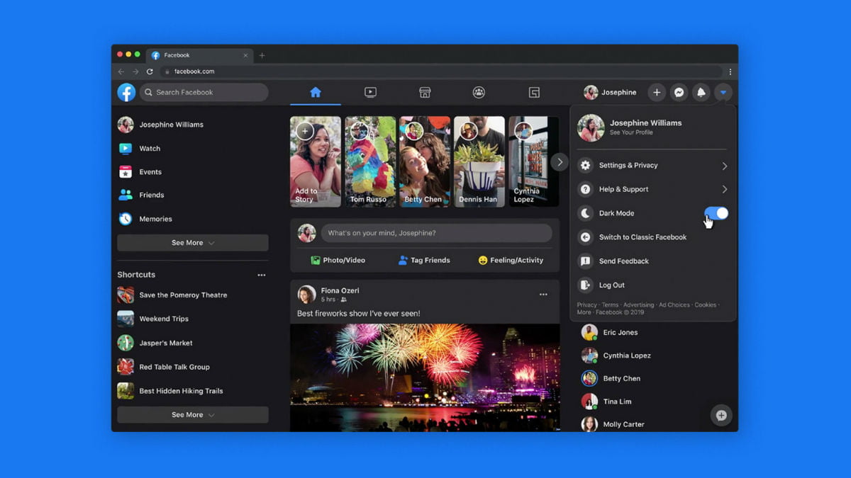
Facebook is one of the most used social media apps in the world. Even today, some people prefer logging in Facebook via the website and not the app. The Facebook app keeps getting updated now and then, but what about the website? In its bid to make the website experience better than ever, Facebook has updated the user interface of the website and added new Dark Mode to it. Earlier in March, this new change to the website was rolled out for the majority of Facebook website users, but now it will be available for everyone in the world.
What will New User Interface Bring to the Table?
Facebook’s website is going to become more comfortable for users to navigate. You will be able to easily access all the groups, events, games, and videos. Now the home page and all the other page transitions will also load faster, just like it does when you use it in the mobile. The design of the website F8 was announced last year and is finally reaching to every user in the world. With the Dark Mode toggle, you will be able to switch to the greyscale look whenever you want to. Also, you can switch between the Dark Mode and Light Mode through a drop-down menu at the top.
New ‘+’ Sign to Help You Manage Different Things
On the top panel, you will find a ‘+’ sign which can be used for different things. With it, you can easily create new events, groups, pages, and ads on Facebook. With the new features of the website, you will be able to preview what your new group would look like before you create it and also how it will look in the mobile. Also, there is a new ‘Watch’ section at the top which will recommend your videos based on your likes and viewing history. With the new ‘Gaming’ section, you will be able to access all your favourite games in a jiffy.
